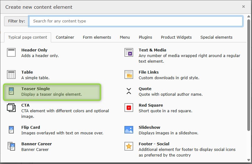
Teaser Single

Basic information

  • editorial teaser element to link internal as well as external content or files
  • horizontal view in cas od direct grid integration
  • vertical view in case of grid container or more than one item in teaser container element
  • different configs for background color possible
  • Links to content HUB articles have to be integrated as “external links” with an absolute link path and target _self to open in the same tab.

Example color = default

Teaser Single kicker
Teaser Single Header

Teaser Single Teasertext, possible in bold and Italic with Subscript and Superscript as simple text styling options.

(background color = default (100% second order color), Textbox left, CSS image class active)

Example color = brand identity

Teaser Single kicker
Teaser Single Header

Teaser Single Teasertext, possible in bold and Italic with Subscript and Superscript as simple text styling options.

(background color = brand identity color, Textbox right, CSS image class active)

Example color = 100% second order

Teaser Single kicker
Teaser Single Header

Teaser Single Teasertext, possible in bold and Italic with Subscript and Superscript as simple text styling options.

(background color = Second order color 100%), Textbox left, CSS image class active)

Example color = 80% second order

Teaser Single kicker
Teaser Single Header

Teaser Single Teasertext, possible in bold and Italic with Subscript and Superscript as simple text styling options.

(background color = Second order color 80%), Textbox right, CSS image class active)

Example color = 50% second order

Teaser Single kicker
Teaser Single Header

Teaser Single Teasertext, possible in bold and Italic with Subscript and Superscript as simple text styling options.

(background color = Second order color 50%), Textbox left, CSS image class active)

Example color = 10% second order

Teaser Single kicker
Teaser Single Header

Teaser Single Teasertext, possible in bold and Italic with Subscript and Superscript as simple text styling options.

(background color = Second order color 10%), Textbox right, CSS image class active)

Example color = white, no CSS

Teaser Single kicker
Teaser Single Header

Teaser Single Teasertext, possible in bold and Italic with Subscript and Superscript as simple text styling options.

(background color = white), Textbox left, CSS image class inactive)

Any questions? Please send us a message.

General Request

Contact Form

Offer Request

Contact Form

Service & Spare Parts Request

Contact Form
Any questions? Feel free to give us a call.

General request

+49 (0) 123 45 67

Offer Request

+49 (0) 123 45 68

Service & Spare Parts Request

Mo - Fr: 7.30 am - 5 pm

+49 (0) 123 45 69
MyZehnder Portal

Enjoy from benefits on our MyZehnder portal. Login with your known credentials or register the first time.